How to Create a Bestseller Cover for Your Coloring Book
Your cover is 80% of the buying decision. The 5 elements that make thumbnails clickable: color psychology, contrast, typography, and layout that converts.
On Amazon, your cover competes as a 100-pixel thumbnail in a grid of dozens. Shoppers give it a fraction of a second. Everything in this guide serves that reality: design for the thumbnail first, the full-size cover second, and the printed object third — in that order.
Element 1: One Hero Illustration
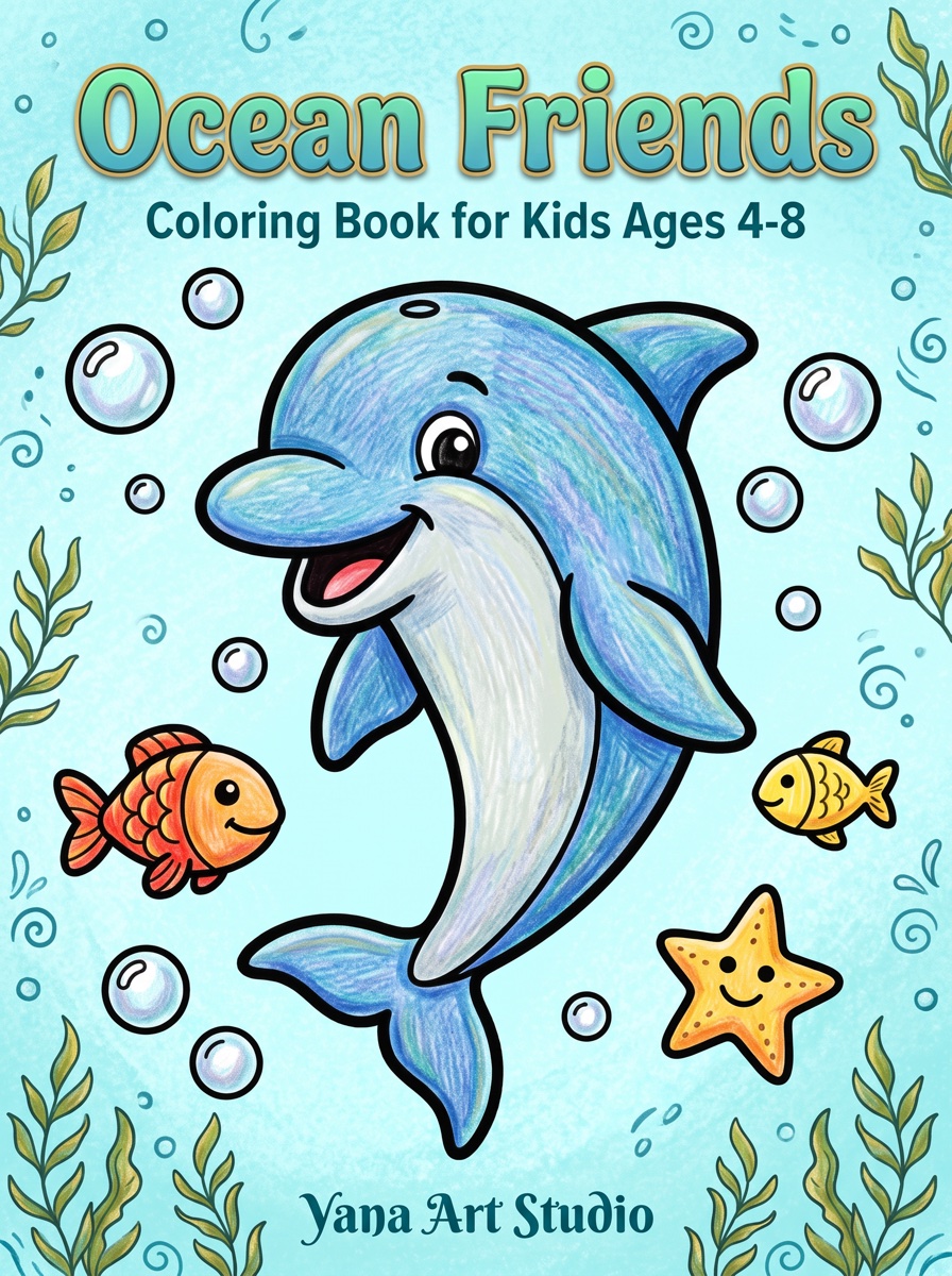
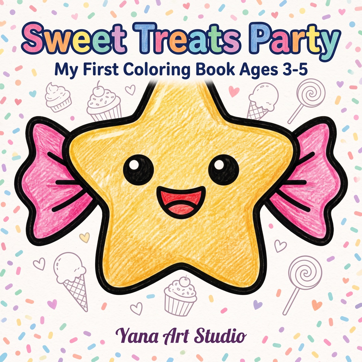
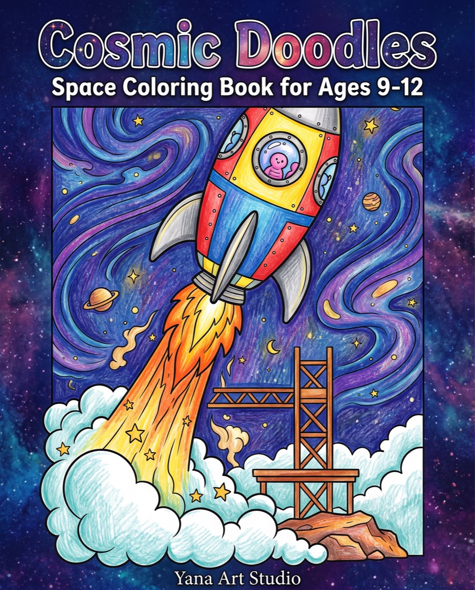
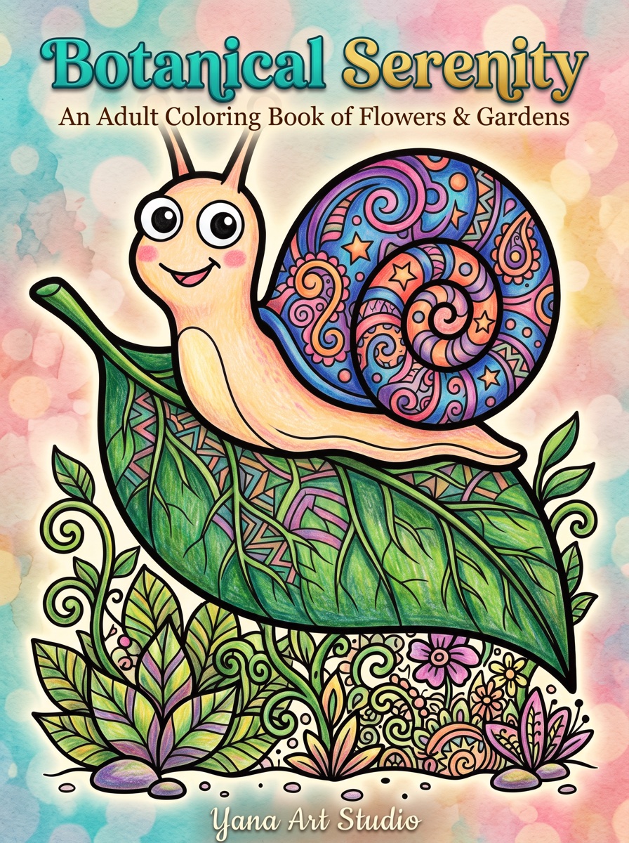
The most common cover mistake is showing six tiny sample pages. At thumbnail size that collapses into visual noise. Winning covers pick one charismatic illustration — the cutest unicorn, the boldest mandala — and let it fill the frame. The buyer's brain completes the promise: "40 more like this inside."
- Show the illustration colored (fully for kids' books, partially for adult books — the half-colored look signals "this is a coloring book" instantly)
- Give it a face or focal point when possible; eyes stop scrolling thumbs
- Leave breathing room — a cramped cover reads as amateur even when the art is good
Element 2: Color That Breaks the White Grid
Search results are black text on white. Covers that survive the grid bring saturated, contrasting color:
- Kids: bright primaries and rainbow palettes — signal fun before the title is even read
- Adult relaxation: deep jewel tones or dark backgrounds with light art — telegraph "premium" and "calm"
- Humor: loud single-color backgrounds (hot pink, teal) with punchy type
- Avoid: white or pale backgrounds that dissolve into Amazon's page, and muddy mid-tones that look gray at small sizes
Element 3: Typography That Survives Shrinking
- Title: thick, rounded, high-contrast lettering; 3–6 words readable at 100px. Playful chunky fonts for kids, elegant-but-bold for adults.
- Hierarchy: title huge, subtitle small, everything else smaller. Three sizes maximum.
- Never: thin scripts, outline-only letters, or type over busy art without a contrast device (banner, outline, shadow).
- Test: zoom your draft to 8% — can you still read the title and tell what the book is? That's the whole exam.
Element 4: Information That Closes the Sale
Two facts on the front cover measurably reduce hesitation:
- Audience: "Ages 4–8", "For Adults" — mismatched complexity is the #1 refund/1-star driver, and stating it filters the wrong buyers before they click (details in the age complexity guide)
- Volume: "50 Designs" — quantifies value against same-priced rivals
A small badge ("Single-Sided Pages", "Bonus Test Page") can add a third differentiator, but stop there — covers with five badges look like discount stickers.
Element 5: A Back Cover That Isn't an Afterthought
Amazon shows the back in the image gallery, and physical gift-buyers flip the book over:
- 3–5 sample illustrations in a clean grid (this is where samples belong — not the front)
- One short benefit paragraph ("50 single-sided designs… hours of screen-free fun")
- Keep the lower-right 2×1.2″ clear — KDP prints its barcode there
The Technical Side (Two Minutes of Math)
- Canvas: back + spine + front in one PDF, plus 0.125″ bleed all around.
- Spine width: page count × 0.002252″ (black ink). An 80-page book: 0.18″. Spine text only fits comfortably above ~100 pages.
- Resolution: 300 DPI, exported with fonts embedded.
- Template: generate the exact-size guide from KDP's Cover Calculator and design inside it — the full spec walkthrough is in the formatting guide.
The Pre-Upload Checklist
- Readable title at 100px? (zoom test)
- One clear focal illustration, colored?
- Background contrasts with white?
- Age range + design count on the front?
- Back cover with samples, blurb, barcode zone clear?
- Spine sized to the final page count?
- Compared side-by-side against the current top 5 in your niche?
Frequently Asked Questions
What size should a KDP coloring book cover be?
A full wraparound PDF: (2 × trim width + spine width) by trim height, plus 0.125-inch bleed on all outer edges. Spine width for black-ink paperbacks is page count × 0.002252 inches — an 80-page book has a 0.18-inch spine. KDP's cover calculator generates an exact template for your size and page count.
Should a coloring book cover show colored or uncolored pages?
Partially colored artwork converts best: it shows what's inside (line art) and the finished result (color) in one image. Fully colored covers are the norm for kids' books; leaving some line art visible works especially well for adult titles.
What makes a cover stand out in Amazon search results?
Thumbnail-first design: a title readable at 100 pixels tall, one focal illustration instead of a collage, high contrast between background and art, and colors that break the white-page pattern of search results. Check every draft at thumbnail size before committing.